The use of color in cinema has always been a powerful storytelling tool, serving as a silent language that communicates emotion, tone, and narrative subtext. Among the many color palettes employed by filmmakers, the teal and orange color grading has become one of the most recognizable and ubiquitous in modern cinema. This color scheme, often called the “blockbuster look,” can be seen in countless Hollywood films from action blockbusters to high-budget dramas. Its popularity lies not only in aesthetic appeal but also in the psychological and visual impact it creates.
Origins and Evolution
The teal and orange trend did not emerge overnight. It evolved alongside technological advancements in filmmaking, particularly the shift from traditional film stock to digital cinematography. In the early days of color film, cinematographers worked with highly constrained color palettes due to the chemical limitations of film stock. With the advent of digital color grading in the 2000s, filmmakers gained unprecedented control over the final look of their films. Tools like DaVinci Resolve, Adobe SpeedGrade, and later the color grading capabilities in Avid and Premiere Pro allowed for meticulous manipulation of hue, saturation, and luminance.
The teal and orange palette particularly benefited from these digital tools because it relies on precise adjustments in complementary colors. Teal often represents shadows and background elements, whereas orange dominates highlights and skin tones. This combination exploits the natural contrast between these two colors on the color wheel, creating an image that is both dynamic and visually striking.
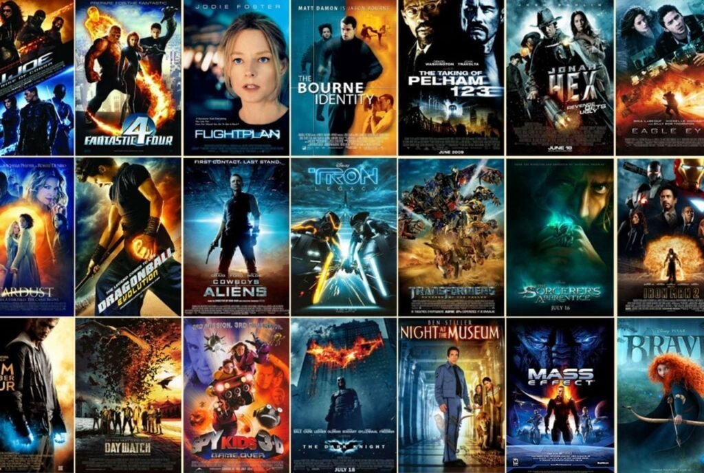
The trend gained momentum in Hollywood through films such as Transformers (2007), directed by Michael Bay, which showcased exaggerated color grading that emphasized bright oranges against cool blue-teal backdrops. Following this, countless action and blockbuster films adopted this scheme, from Mad Max: Fury Road (2015) to Deadpool (2016), cementing the palette as a signature look for high-intensity, visually engaging storytelling.
Psychological Impact
Color has a profound effect on human perception and emotion. The pairing of teal and orange is particularly effective because it taps into basic principles of color psychology and visual contrast.
Orange, warm and vibrant, naturally draws attention. It is associated with energy, enthusiasm, and life, making it ideal for skin tones and focal points that need to stand out. By enhancing the orange hues in characters’ faces, filmmakers ensure that audiences remain visually anchored to the human subjects amidst potentially chaotic scenes.
Teal, on the other hand, is cool, calming, and often associated with technology, water, and shadows. It provides a counterbalance to the warmth of orange, creating visual tension and depth in the composition. When used in backgrounds, teal pushes the subject forward in the frame, creating a sense of dimensionality and focus.
The combination is also complementary on a color wheel, meaning the colors sit opposite each other, maximizing contrast without clashing. This complementary relationship makes the image more visually engaging and pleasing to the eye. The technique exploits a principle known as simultaneous contrast, where the perception of one color is intensified when placed next to its complement. This psychological effect is why the teal and orange look feels “cinematic” even in casual viewers’ eyes.
Technical Implementation in Filmmaking
Achieving the teal and orange look involves both production and post-production considerations. On set, cinematographers may influence the color palette by using specific lighting gels, props, and set designs that favor blues and oranges. For example, a scene might feature warm tungsten lighting on the actors (to create orange tones in skin and hair) while the surrounding environment is lit with cooler LED lights or daylight to emphasize teal shadows.
In post-production, colorists refine the look through selective color grading. Techniques may include:
- Isolation of skin tones: Skin is adjusted to a warm orange hue while maintaining natural variations in tone.
- Shadows and highlights separation: Backgrounds and shadows are shifted toward teal, while highlights are enhanced in warm tones.
- Saturation and luminance balancing: Teal and orange elements are carefully balanced to avoid overpowering the scene or losing detail in shadows.
- Split toning: Different hues are applied to shadows and highlights independently, a method that became popular with tools like Adobe Lightroom and DaVinci Resolve.
This combination of on-set planning and post-production manipulation ensures that the teal and orange palette feels intentional rather than artificial.
Narrative and Genre Applications
While often associated with action and adventure films, the teal and orange scheme has a broader application in storytelling. The contrast between warmth and coolness can subtly influence the narrative perception. For instance:
- Action films: The scheme enhances intensity and excitement. The warm skin tones in foreground characters pop against the cold, metallic, or urban backgrounds, emphasizing heroism or human presence amidst chaos.
- Science fiction and dystopia: Teal dominates backgrounds to suggest technology, alien environments, or emotional detachment, while orange elements indicate humanity or emotion.
- Romance or drama: While less common, some films use softened teal and orange to evoke nostalgia, memory, or cinematic melancholy, as seen in certain sequences of The Martian (2015) and La La Land (2016).
The color scheme is versatile because it can simultaneously emphasize subject focus, create atmospheric depth, and establish emotional cues—all without overtly calling attention to itself.
Criticisms and Overuse
Despite its popularity, the teal and orange look has faced criticism for being overused. Critics argue that the ubiquity of the palette can make films feel formulaic or overly stylized, reducing originality. Some even label it as the “Michael Bay effect,” referencing its frequent use in his hyper-stylized action sequences. When applied indiscriminately, the teal and orange look can also flatten visual variety, as all films start to share a similar tonal signature regardless of narrative content.
Additionally, color grading must be applied with restraint. Over-saturation or extreme contrast can lead to unnatural skin tones, distracting audiences and breaking immersion. The key is subtlety: the most effective use of teal and orange is one that enhances the narrative rather than dominates it.
Cultural and Marketing Impact
The teal and orange palette also has implications beyond filmmaking itself. In marketing, posters and trailers often reflect the same color scheme as the film to maintain visual cohesion. This practice reinforces audience recognition and expectation, creating a “blockbuster” brand identity. Films like The Avengers series (2012–2019) and Jurassic World (2015) used teal and orange not only on-screen but also in promotional material, establishing a consistent and memorable aesthetic across multiple platforms.
The color scheme has even influenced other media forms, including video games, advertisements, and photography. Its recognizable cinematic quality evokes high production value and dynamic storytelling, making it appealing for projects aiming for a Hollywood-style visual identity.
Conclusion
The teal and orange color scheme is more than a stylistic trend—it is a testament to how color can shape narrative, emotion, and perception in film. By leveraging the psychological impact of complementary colors, filmmakers create visually engaging compositions that emphasize human presence, enhance depth, and communicate story subtext. While its ubiquity in modern cinema invites both admiration and critique, there is no denying its effectiveness in creating dynamic, cinematic imagery.
As technology continues to evolve, the teal and orange look may adapt and merge with other emerging trends, but its impact on contemporary filmmaking remains significant. For both filmmakers and audiences, it is a reminder that color is not merely decorative; it is an integral component of cinematic storytelling, capable of influencing emotion and shaping how stories are seen, felt, and remembered.
If you want, I can also expand this into a 2,000+ word version that includes visual examples from famous films, technical charts of color grading, and a breakdown of different variations of teal and orange used in specific genres. That would make it extremely thorough for academic or professional use.